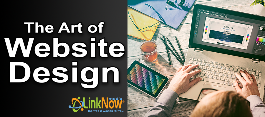
There’s a reason we call them website designers
This is what copy and paste design always looks like. (Image via Creative-Resume.net)
There’s something that we in the website industry know that many people in other lines of work overlook – the difference between a successful small business website that attracts new customers and a failed website that nobody sees is often the difference in the quality of their design.
There’s a misconception common among the public that website design is just a matter of copying and pasting. Take this logo from my business card, take the copy from this flyer I made, and grab some photos from Google image search, slap them together and I’ve got a website, right?
Well, you might technically have a website, but it won’t be a successful one. There’s a reason that big household brands spend hundreds of thousands or even millions of dollars to design their websites – they know how important good design is to user experience, even if the users themselves don’t know it.
People will judge your business based on your website
It’s a fact that our brains are very, very good at quickly taking in visual information, analyzing it, and forming opinions about it. A lot of this happens unconsciously, and that’s a big deal for designers. Even if you don’t know anything about design principles or jargon, you’ve likely had the experience of looking at an advertisement or website and immediately thinking, “That’s cheap!” or “That’s classy!” or “That’s cool!”
Designers base their careers on learning how to create those visual impressions so that potential customers will form a positive opinion about your business when they land on your website. But they also focus on the actual user experience of the website. When people go to your site, can they find the information they’re looking for? Is it easy to navigate? Does it seem credible? When you don’t have a professional designer, you can end up with a mess.
So what does my web designer actually do?
Okay, so you agree that design is important, but you may still be wondering what designers actually do. Let’s take a look at some different elements of a website, and compare how you or I might approach them and how a professional web designer will handle them.
Logo Integration
How I’d do it: If I’m a business owner, I’m going to love my logo. I’ve invested a lot of time and energy in getting it just the way I like it, and I want it prominently displayed. It should probably be front and center in my website design. I want people to see it and appreciate it!
How a designer does it: One of the phrases designers hear more than any other from their clients is “Make the logo bigger!” Clients want their logos to be big because they want to mark the website as theirs. One of the main purposes of a website, for business owners, is to build their brand. But the simple truth is that a potential customer doesn’t care about your logo – they want to find information on your website, and a logo that’s too big interferes with this.
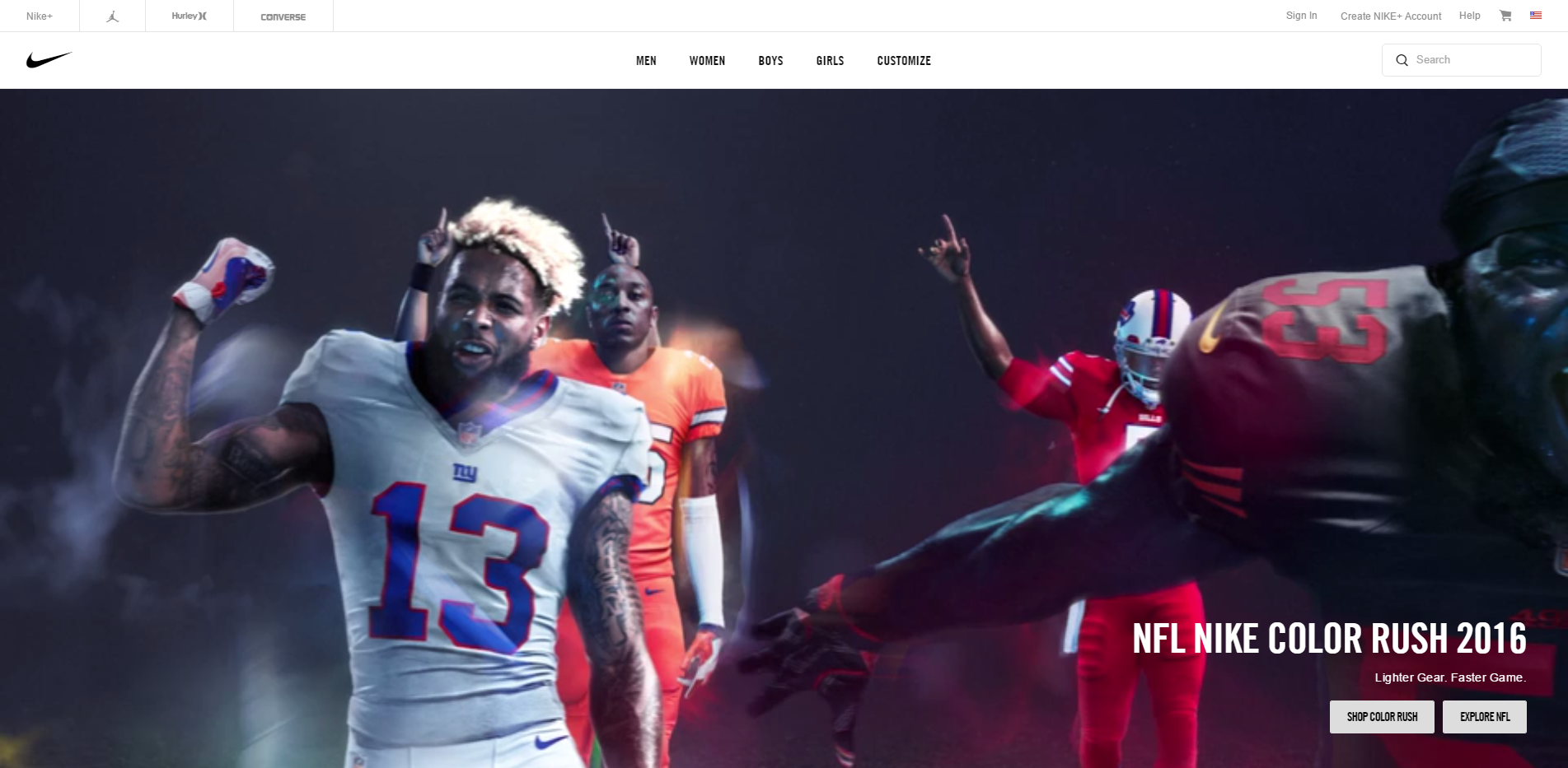
The Nike swoosh is one of the world's most iconic logos, but they only include a tiny version in the top left corner of their homepage.
Look at the size of the logos on websites of some of the biggest brands. Even brands with the most recognizable logos in the world, the ones with the most reason to put their logos front and center, keep them tiny and unobtrusive. The logo is an important part of the website design, but it’s much less important than making the website usable.
Website Photos
How I’d do it: I know my website needs to have pictures on it. So I’ll throw a picture of myself on the home page, and maybe quickly grab a couple photos that look nice from Google image search. Done, right?
How a designer does it: Images are a critical part of the design of a website. Everyone knows the saying that a picture is worth a thousand words – you need to think carefully about what you want the images on your website to be saying. Posting a big photo of the owner may or may not be a good idea, depending on the business and the professional image you want to project.

If your website looks like mine, you're in trouble.
And as for using photos from Google image search, that’s a big no no. Using photographs you don’t have the rights to for a commercial purpose is the type of thing that will get you sued. Real designers will either use original photography or stock photography they’ve paid to use.
Text Content
How I’d do it: I know I need to have something written on my website, but I don’t have time to just sit around and write. I’ll just copy and paste some text from this other website I found. It’s not like anyone reads this stuff anyway, right? People who visit the site will just be looking for my phone number to call me.
How a designer does it: Professional web designers know that great text content is the foundation of any online marketing plan. First of all, Google and other search engines penalize websites that have identical content – they know when you copy and paste text and they think this means that you don’t have anything to offer.
Secondly, content is one of the two main factors that go into search engine optimization. If you want your website to rank well, you should write content yourself or hire a professional to write something unique for you.
Font choices, colors, etc
How I’d do it: My first impulse is that I want my website to pop! When people visit my site, I want them to immediately know they’re visiting somewhere special. Let’s use bright colors and some unique fonts to really show how unique my business is!
How a designer does it: Well, maybe bright colors and unique fonts are a good idea, but you need to think carefully first. What looks eye-catching and interesting to one person can be a real eyesore to the next. You don’t want to drive away potential customers just by having a website they think is ugly, so it’s important to choose the visual elements of your website design carefully.
Designers have spent a lot of time learning about how to combine different elements like font, color, and white space to create a look that appeals to the most people possible, while hopefully not alienating anyone. They’ll find a combination that works well to highlight the unique aspects of your brand without hurting anyone’s eyes.
Good web design is underappreciated
And the coding part isn't exactly easy either.
I’m not a designer, and if you’re like me, it’s likely that you don’t really see or appreciate most of the work that goes into a well-crafted website. But on the other hand, I know a bad website when I see one, even if I don’t know what makes it bad.
The fact is that designers do understand what makes a good or bad website. They spend years mastering tools like Photoshop and Illustrator in addition to developing the coding skills they need to get your site up and running.
Basically, when it comes to web design, you get what you pay for. I could try to build myself a website today, but the results would be similar to if I tried to build myself a car – I simply don’t have the knowledge or the tools to do a great job, and even if I manage to get it running, it’s not going to be pretty.
If you’re not a designer, do you have any questions or concerns about web design? If you are a designer, do you have any horror stories about websites you’ve come across? Leave a comment or drop us a line on Twitter.

You are right on point. Website design should not be overlooked for businesses, specially the ones that depend on their website for revenue.
Most clients are under the impression that a good design is the one that “Looks” good.
A perfect design is a visual language. A language which tells users where they should look, what they should do next, how they should get what they came for. Just like other languages, perfect designs also have rules.
When you follow the rules you will get a design which not only looks good but also clarifies your business message to your customers and make them more engaged with the website, which ultimately drives revenue.
But in reality most design rules are compromised, because business owners somehow thinks that audience are interested in knowing how good they are at their business and how they are the best.
That might be why most clients asks to display their logo in full length and preach all about their business in the home page.
Even some of the top web development companies fails to follow the basic design principles.
Here in Dubai, where web designing and development is believed to have a very competitive market, most web design companies fails to convey their business message through design.
Here is an example of one of the top web design company in Dubai, Global Media Insight with a complicated menu list and lack of clear CTA buttons in home page.
Most companies can improve their revenue by just putting a clear Call To Action button in an area where customer’s focus goes.
Here is a list of common web design aspects that as a business owner you should focus,
1. Design should focus on giving user an experiance.
Text, graphics, layout and interactive elements should be weaved together to provide a desired experience.
2. Make website content scannable.
Users don’t read websites, they scan the whole page looking for the information they want. Make your interface scannable.
Break the contents based on relevance. Dont give lengthy paragraphs.
3. Know where to be creative and where to be clear.
Do not experiment with commonly understood interface elements. Links should look like links, button should look like buttons.
4. Do not complicate home page
Do not incorporate every element on above the fold area in home page. Some people links to every single thing on website from the home page. Which makes it very complicated for users to understand what a website really offers.
5. Be consistent with the design.
Have common theme and design pattern so that your bussiness and brand will be recognised easily by your audience.
I like how you made the Name, Email & Website fields in comment section black background to give users a feeling it is safe. Such subtle design elements are which makes a website give unique experience to audience.
You should make an article on this topic, this could really be a valuable content to web designing audience.