
If you still don't have a mobile site, you want to read this
Just over a year ago, we reported that Google was planning to put an increased emphasis on the importance of websites being mobile friendly. In what became known as “Mobilegeddon,” Google promised that sites that were not optimized for mobile devices would soon take a major hit in their search ranking.
People debated the extent of the impact that Mobilegeddon had on search results, but one thing was certain – Google had taken a firm stance and made a commitment to providing the best possible user experience on mobile. Now they’re stepping it up – they’ve announced that in May they are going to put even more of an emphasis on mobile.
Why is Google doing this?
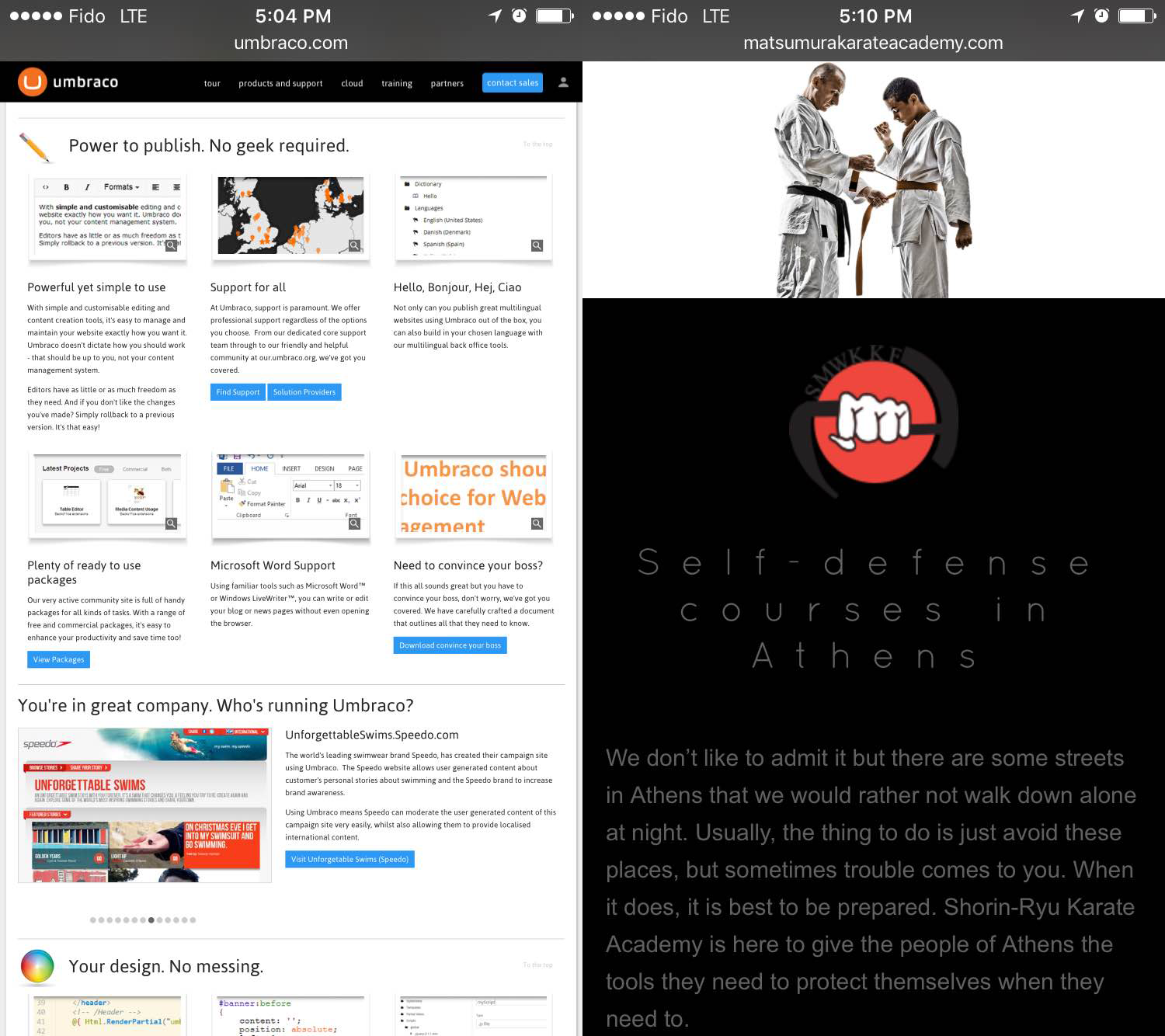
The site on the left is optimized for desktop. The text is tiny and hard to read, and the links are too small to accurately tap on a phone. The responsive site on the right, in contrast, is easy to read and to navigate.
It may be surprising to some people, but the majority of internet activity is now happening on mobile devices. Whether someone is viewing a website on their phone or on a tablet, they have a very different viewing and use experience than they do on a desktop computer. Websites that are designed for desktop computers are often nearly unusable on a smart phone, which makes them a bad result for anyone searching on a phone.
Google engineer Paul Haahr gave a presentation at the recent SMX West conference in which he emphasized, “First of all, we’re really thinking about the world in a mobile first way, that we’re just seeing much more of our traffic coming from mobile than it ever has. That is changing the way we think about the search results page. That is changing a lot about the way we think about search.”
According to Google, more Google searches now take place on mobile devices than on computers, so it makes sense for them to do everything they can to make sure they are delivering great search results to mobile users – and this means moving sites that won’t work well on their devices lower in the search results.
What does this mean for you?
On a basic level, it means that if your website isn’t mobile friendly, you’re going to be facing an even bigger search penalty, starting this May. We advised all of our clients to make sure they have mobile friendly sites over a year ago when Google first began penalizing non-mobile sites. However, if you’ve been holding out, now is the time to act – mobile is the future and your site simply will not rank well if it’s still not mobile friendly.
What does “mobile friendly” mean?
Mobile friendly just means that a site is designed to look good and be simple to navigate when it’s loaded on a mobile device.
There are two basic ways that web designers create mobile friendly experiences:
- Dedicated Mobile Site. Designers build an entirely separate site that is optimized for mobile. When you access their site from a mobile device, you are redirected to the mobile version. This is rarely used anymore because with the wide variety of screen sizes on mobile devices these days, a site designed to look good on one screen still may not look good on another. Also, this is a significantly more expensive option, as it requires building two fully functional websites instead of one.
- Responsive Design. The site is designed to automatically resize and reposition its elements to look great, no matter what size the screen is. This is much more common these days, because it’s more versatile and less expensive.
Not sure if your website is mobile friendly? All LinkNow Media website packages feature responsive website designs.
The Future is Mobile
However you choose to do it, it’s important that you make sure your website is mobile friendly by May, if it isn’t already. You’ve invested a lot of time and money into your website and online marketing, but if nobody can find your site because Google is penalizing it for not being mobile friendly, then all that investment will have been for nothing.
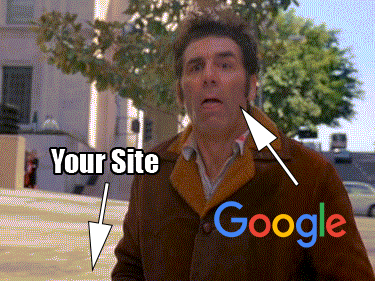
If your site isn't mobile friendly by May, Google will be distancing themselves from you pretty darn quickly.
But the good news is you still have time to act before the new penalties kick in. If your site isn’t responsive yet, talk to your designer about getting an upgrade today!
Confused? Questions? Leave a comment, or contact us on Twitter.

Interested in mobile friendly web site and the cost of doing so …Robert