
Google has made it very clear that mobile browsing is the future of its search platform. Recently, the search giant completed its years-long effort to migrate to mobile-first indexing for all websites, which means having an adaptable, responsive design is more important than ever.
Here at LinkNow, we’ve seen this writing on the wall for quite some time now, which is why we have long since transitioned our websites to reflect the market trends and larger industry focus on mobile browsing. In this blog post, we will be examining why all our websites are adapted for mobile phones, as well as the reasoning behind our constant adjustment in the SEO industry.
The Rising Need for Mobile-Friendly Search
Before we can look at LinkNow’s solution to mobile SEO, we first need to understand the problem that our company—and all other website developers—was facing. All the way back in 2016, Google announced that it would begin transitioning its crawling, indexing, and ranking systems to focus on mobile versions of websites, rather than desktop versions.
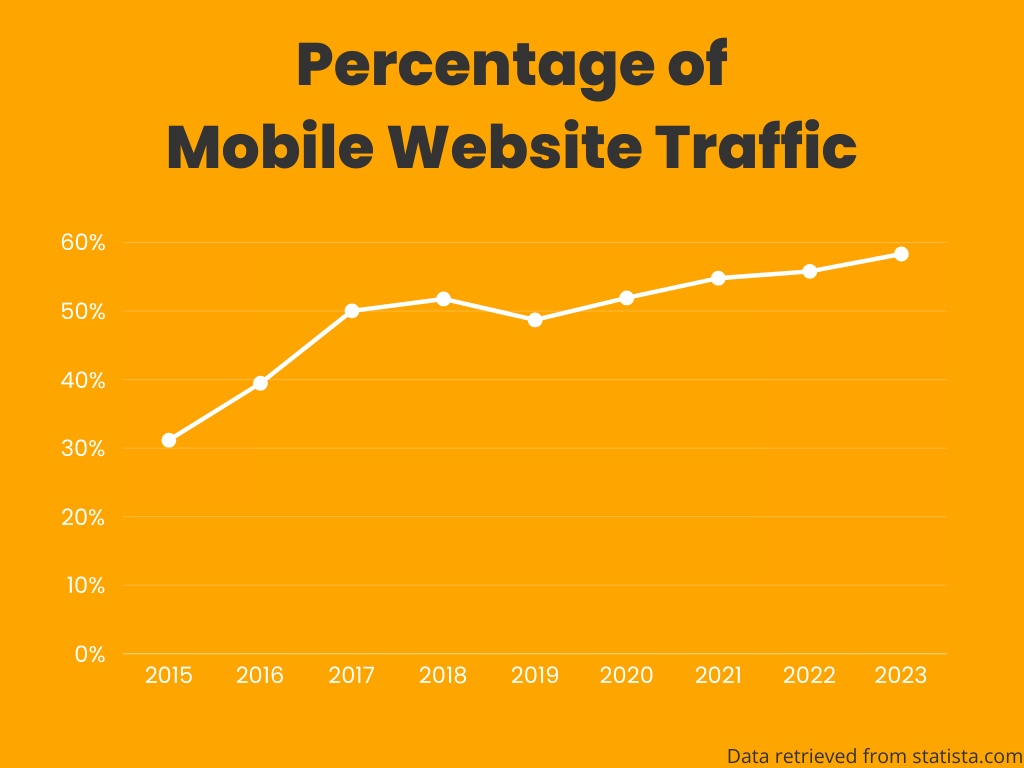
The logic behind this change becomes apparent when you look at the data: by that point, about half of all searches were conducted on mobile devices, and this statistic continued to trend upward. At this time, all of Google’s search recommendations were based on the desktop versions of websites, which often did not have the same content, structure, and experience when viewed on a mobile phone.
So, Google did what any forward-thinking company would do and started to consider how to provide a better experience to its growing base of mobile users.
The Slow Transition
Because Google is such a large and interconnected platform, most of its big updates need to be implemented gradually. If it moves too quickly, Google risks creating bugs or technical problems with the platform. The ripples of this are often felt by website owners and SEO professionals when even the smallest update to Google’s algorithm can prove volatile and tank their ranking overnight.
That being said, the switch to mobile-first design was always going to be a big change to the digital landscape. It represents not just a technological shift but a cultural one as well. Even the first algorithm update in this direction was dubbed “Mobilegeddon” due to it signaling the end times for the old way of search.
The initial rollout of mobile-friendly search only applied to rankings on mobile devices (not desktops or laptops) and was essentially just a yes or no question about whether your site could be displayed correctly on a phone, however, it laid the foundation for all future updates.
Although the change in rankings was not as drastic as some analysts predicted, one thing had become clear: you needed to get with the times and embrace the mobile-friendly future.
What Is Mobile-First Indexing Anyway?
Although Google started using mobile-friendliness as a ranking factor with its Mobilegeddon update, it was only just beginning to test mobile-first indexing for a small number of websites, and it wouldn’t be until 2018 when it started to roll this out more broadly.
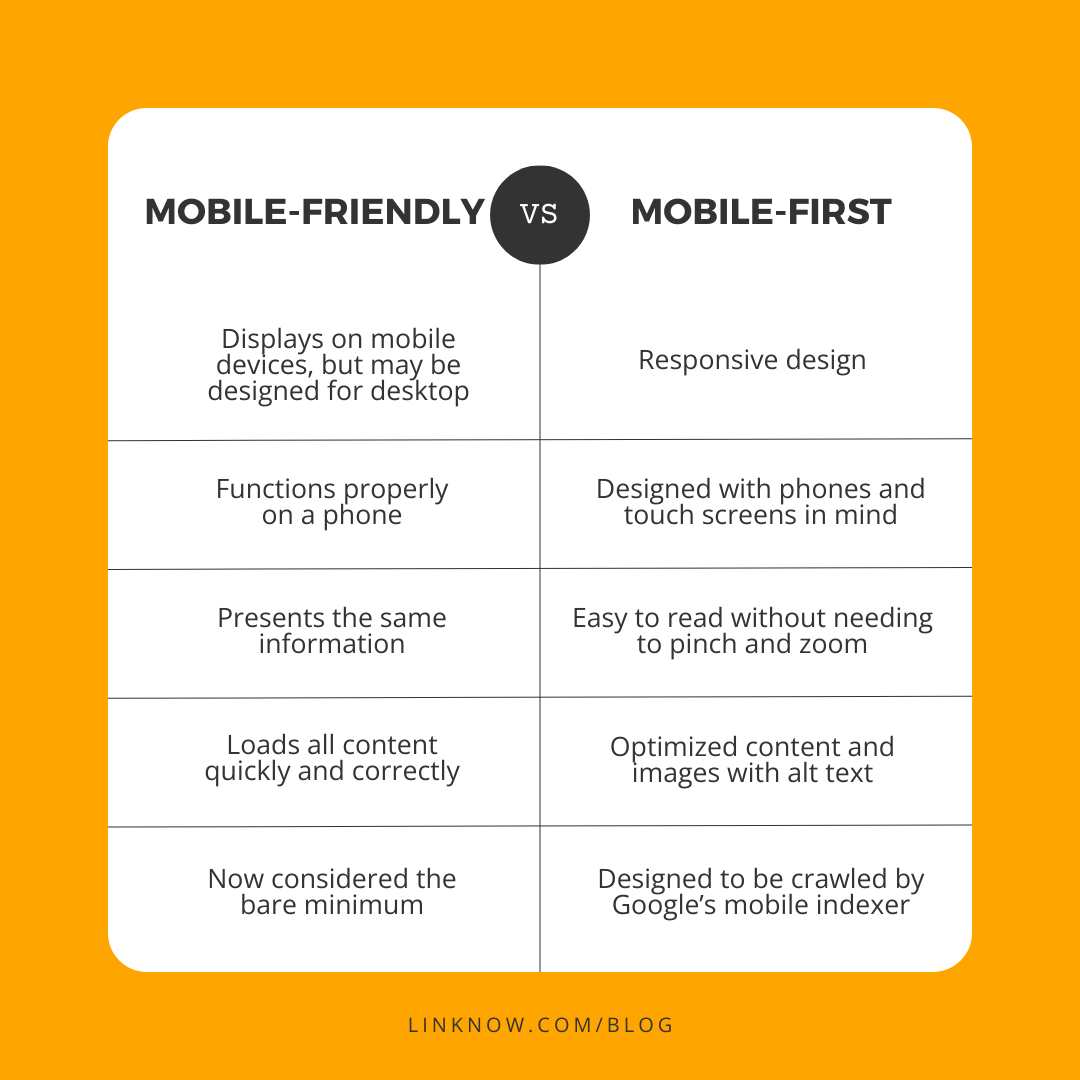
So, what exactly is the difference between being mobile-friendly and mobile-first indexing? We’re glad you asked!
Being mobile-friendly simply means that your site can display correctly on a mobile device. It was essentially an add-on to an existing website that was already designed with desktop users in mind. Mobile-first indexing takes this a step further by making the mobile version of a website the primary source when it comes to analyzing a website to be ranked on Google.
Google has a wide variety of tools and algorithms for crawling the internet and sorting the data that it collects. After mobile usage passed the threshold of 50% of all internet traffic, Google changed its viewpoint from that of a desktop user to the growing number of mobile users. This means that the mobile version of a website would now become the default factor for whether a website will land in the search results.
Like we mentioned earlier, however, this didn’t affect all websites at once. Mobile-first indexing was first revealed in 2016, but it was not until late 2018 that Google passed 50% of crawled sites indexed by their mobile version. It passed 70% of crawled sites in 2020, but technical issues and other roadblocks slowed the further updates. Finally, in 2023, Google announced that it had completed its switch to mobile first-indexing.
How LinkNow Tackled This Problem
Here at LinkNow, we believe that being proactive is much better than rushing to find a solution to a problem. With this in mind, we work hard to study the digital marketing industry, predicting the ebbs and flows on the horizon and setting our course long before deadlines arrive.
This focus on foresight is clearly illustrated by the rollout of our first fully mobile-friendly website template on December 7th, 2012—four years before Google started making changes to its platform!
Our digital marketing experts saw the trend toward mobile browsing long before it became an industry standard and started preparing for the inevitable algorithm changes. When Google announced that it would begin to focus on mobile versions of websites, neither we nor our clients had anything to worry about because we were already on top of it.
But the work didn’t stop there.
As seasoned SEO professionals, our team understands that keeping up with Google and digital marketing trends is a never-ending pursuit. It requires on-the-fly thinking, smart decision-making, and technical problem-solving. Ever since releasing our first mobile-friendly websites well over a decade ago, we have continued to refine and optimize our designs to provide our clients (and their clients!) with industry-leading online experiences.
The Challenges of Mobile-First Indexing
In a world where mobile-friendly browsing is top priority, just making sure your website displays properly on a small screen is not enough to increase placement on the search engine results page. Without getting too technical, here are a few ways that we overcame the problems presented by mobile-first indexing.
Page Layout
This should come as no surprise, but it is important to ensure that your website is visually appealing and functionally designed, regardless of what type of device it is being viewed on. For example, if you have images or videos displayed prominently on your desktop site, they should also appear near the top of the mobile version so that users don’t need to scroll down the page to find them.

An example of a mobile-friendly website that displays correctly and presents relevant information for SEO
Another good strategy for creating a mobile-friendly layout is responsive design. This is when your website can display your content differently based on the screen size of the device being used. Rather than having a static website that may not fit optimally for the particular size of the user’s screen, a responsive web design will automatically structure its content in a way that fits perfectly.
User Experience
Providing a positive user experience is important for both desktop and mobile sites, but mobile-first indexing means that you want to ensure your mobile website is fast, consistent, and stable for anyone who visits it.
Adhering to Google’s Core Web Vitals is a great way to ensure your website performance is up to snuff. Essentially, this means your website will load all its main content quickly, respond well to all interactions, and maintain its intended layout during the loading process.
Providing Relevant Information
It’s a smart practice to ensure your mobile site contains all the same content as your desktop site, or at least presents all the information that will be relevant to people trying to find your website. When Google is crawling and indexing the mobile version of your site, you want to ensure you put your best foot forward and provide all the great content you created that will help you outrank the competition.
One of the places that this is often overlooked is with photos on websites. Including descriptive alt text (written copy that displays in place of an image that fails to load) is crucial for both SEO and accessible website design. At LinkNow, we make sure all the images on our clients’ websites have strong alt text that ensures Google’s web crawlers understand their photos and promote them accordingly.
Back End Issues
We promised to keep this section simple, but it is worth mentioning a few invisible issues that are important for SEO, even if they do not affect user experience. For starters, it is recommended that you keep the structured data of your website the same between all versions. Second, don’t forget to add meta descriptions to the mobile versions of your web pages.
Don’t worry if you haven’t heard these terms before—the web design team at LinkNow can handle everything on the back end of your website and ensure that everything is how it should be.
What’s Next?
As Google phases out its desktop crawler to save resources, it feels like we are finally closing the book on the nearly decade-long process of switching to mobile-friendly browsing and mobile-first indexing. But this doesn’t mean that we can just sit back and enjoy the fruits of our labor.
With over 20,000 websites and many years of industry experience under our belts, we here at LinkNow have a keen understanding of the shifting seas of digital marketing—where the only certainty is uncertainty. That being said, we also know that navigating the SEO ocean is also possible with careful preparation, smart problem-solving, and a good sense of direction.

Adaptation and improvement have always been core tenets of LinkNow’s operation, and these strengths are part of why we have over 10,000 active clients who trust us to keep their website up-to-date and outshining their competition.
Our web designers and marketing professionals keep their ears to the ground and make sure they are prepared for any upcoming changes to algorithms or other aspects of the digital world. We are always quick to embrace the latest trends in web design, and even when unexpected changes happen (Google likes surprises) we are quick to act and update our approach.
Helpful Resources for a Mobile-Friendly Future
If you want to double-check that your website is mobile-friendly, Google has made this easy with their mobile-friendly test tool. You can also review their mobile-first indexing best practices for an in-depth look at what web developers should keep in mind when designing a modern website.
Alternatively, if you need help adapting to mobile-first indexing and maintaining a website that is responsive, visually appealing, and geared for search engine success, consider partnering with the online experts at LinkNow. You can compare our various website packages here or get in touch with us at 1.888.667.7186 to speak with one of our digital marketing specialists.