Back in March, Google announced it was launching its new mobile-first indexing. The reactions were split down the middle. Some lauded it as a much needed (and highly anticipated) improvement. Others, fearing that their ranking was going to plummet, panicked.
But if there’s one thing that just about everyone agreed on, it’s that the rollout of mobile-first indexing left business owners, webmasters, and marketers confused. Confused about how it would work. Confused about how long it would take to implement. Confused about how it would affect ranking.
To try to clarify what Google’s mobile-first indexing is and what it means for businesses, we’ve scoured the Google blogs, forums, and Twitter pages to try to get answers.
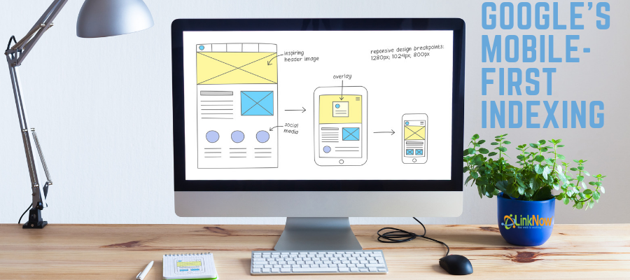
What is Mobile-First Indexing?
Indexing is the way Google organizes all the websites and web pages that make up the internet. In the past, Google would send out its ‘spiders’ or ‘crawlers’ to scour the web for new content, websites, and pages. When it found new pages it would organize them into its index so that users could search for them. Up to now, the crawlers were indexing desktop websites first
The new mobile-first index is designed to do the same thing but for mobile sites. That means that if you have a mobile site you’re already ahead of the game. Google’s crawlers will index and rank it in more or less the same way as it did with desktop sites. Just as your desktop site is viewable on mobile even though it’s not designed for it, Google’s crawlers will index your desktop site in its mobile index.
What Does Mobile-First Mean for Ranking?
The basic idea is that your mobile site will be interpreted as your definitive website. For those who have both a mobile and desktop website, the ranking will be based on your mobile site. If you don’t have a mobile site, the mobile-first index will refer to your desktop.
It also means that if you’re in the process of designing a mobile site but haven’t finished it, don’t launch it until it’s really done. Your desktop site will work fine for ranking on Google. Launch your mobile site when you’re ready to have it ranked in the new index.
What If I Have More Content On My Desktop Site?
Two big differences between mobile and desktop are the quantity of content and the way it’s displayed. If your mobile site has less content than your desktop, it’s time to update. Make sure that you’re including the same content on your mobile site.
However, this means the return of some dynamic design tricks. Expandable content like hidden tabs, accordions, and drop-down menus work well on mobile but badly on desktop sites. So, if you’ve been avoiding using them for SEO reasons, you can apply them to mobile to actually improve SEO. They’ll be valued for their full weight on mobile.
What Does Mobile-First Mean for the Future?
Many people are speculating on this right now. One of the big questions is: if we’re moving away from desktop sites, what will happen to rankings determined primarily by links and URLs? Could it be that Google is moving away from a content organizing system based around URLs? And what does it mean for backlinks and the rankings determined by them?
These questions are still up for debate. One thing’s for sure though. If you’ve been putting off building your mobile site, now’s the time to do it!