Overview
Your brand’s fonts and colors are more than simple design choices. This LinkNow blog breaks down why design elements are powerful tools that shape perception, build trust, and influence how customers feel about your business.
Highlights
- • The Hidden Language of Visual Design
- • The Psychology of Color in Branding
- • How Fonts Shape Perception
- • The SEO Connection: Why Design Choices Matter for Rankings
Introduction
Your brand starts talking long before you say a word. From the moment someone lands on your website or scrolls past your post on social media, the fonts, colors, and layout you’ve chosen start telling a story.
In today’s crowded markets, standing out isn’t just about having great products or services—it’s about how you present them. The right shade of blue can build trust. The wrong font can make you seem unprofessional. Even subtle inconsistencies across your website and social channels can make potential customers hesitate.
This guide breaks down how small businesses can use design psychology to strengthen branding, improve recognition, and even boost SEO performance.
The Hidden Language of Visual Design
Before a potential customer reads a single word on your website or social media post, their brain is already forming opinions.
Research from the Missouri University of Science and Technology found that users form a first impression of a website in less than two-tenths of a second. In that blink of an eye, your colors, fonts, and layout are silently communicating what kind of business you are and whether visitors should trust you.
Visual design is a language of its own. Every curve, contrast, and color cue triggers subconscious associations. Clean layouts with balanced spacing feel trustworthy and professional. Cluttered pages filled with mismatched fonts and random color choices feel rushed and unreliable. When design elements align with your brand’s personality, they instantly create familiarity and comfort, helping visitors feel they’re in the right place.
Consistency Matters in Business
Consistency plays a major role in how people perceive your business. When your website, social media profiles, and printed materials share the same color palette, typography, and tone, it sends a message of stability and reliability.
Think of recognizable brands like Starbucks or Apple—their consistent visual language makes them easy to identify even without a logo in sight. Small businesses can harness this same power by applying unified design choices across every touchpoint.
The trust earned by consistent branding translates into measurable results: Visitors stay longer, engage more often, and are more likely to convert into paying customers. Over time, this consistency encourages word-of-mouth referrals, because people remember and share brands that feel dependable and polished.
The Psychology of Color in Branding
Color is one of the first things people notice about your brand, and is often one they last forget. Studies show that up to 90% of first impressions about products and brands can be based on color alone. That means your color choices aren’t just aesthetic—they’re strategic.

Think of the deep red of Coca-Cola or the golden arches of McDonald’s. Those colors aren’t random. They’re part of an intentional branding strategy designed to create instant recognition. When someone sees Coca-Cola red, they think refreshment. When they spot McDonald’s yellow, they associate it with warmth and happiness. Over time, those consistent visual cues become mental shortcuts that connect emotion with brand identity.
For small businesses, maintaining that same level of color consistency across your website, social media, signage, and printed materials builds cohesion and professionalism. It reassures your audience that your brand is stable and trustworthy, no matter where they encounter it. In contrast, using slightly different shades or switching up your palette from platform to platform can confuse your audience and make your business look disorganized or inexperienced.
A consistent color scheme helps your business stand out in crowded markets. It acts like a visual signature and is something customers recognize instantly and associate with quality, dependability, and care.
What Different Colors Communicate
Colors carry psychological weight. They influence how people feel about your business before they even read your message. Choosing the right color palette helps communicate your brand’s personality and values.
Here’s what some of the most common colors say about your business:
- • Blue: Represents trust, reliability, and calm. It’s a favorite in finance, healthcare, and tech because it conveys confidence and stability.
- • Red: Evokes energy, urgency, and excitement. It’s commonly used by restaurants and retail brands that want to create a sense of passion or drive quick decisions.
- • Green: Symbolizes growth, balance, and sustainability. Eco-friendly, wellness, and landscaping brands often use green to reflect harmony with nature.
- • Yellow: Radiates optimism, creativity, and friendliness. It’s an inviting color that works well for brands targeting families or younger audiences.
- • Black/gray: Suggest sophistication, authority, and modernity. These shades are popular among luxury retailers and tech companies that want to appear sleek and professional.
- • Purple: Represents creativity, imagination, and innovation. Artistic, beauty, and boutique brands often use purple to convey originality and depth.
How Fonts Shape Perception

Fonts set the mood for your brand. Before anyone reads the actual message, the style of your text already influences how it feels. A bold, geometric font can convey innovation and confidence, while a soft, rounded typeface feels friendly and inviting.
Imagine a law firm using Comic Sans. It immediately feels out of place, unprofessional, or even unserious. Now, picture that same firm using Times New Roman or Georgia. Suddenly, the brand feels dependable and authoritative. That’s the power of typography: It quietly frames the way people interpret your message long before they process your words.
The good news for small business owners is that you don’t need a massive design budget to get it right. Platforms like Google Fonts and Adobe Fonts offer hundreds of free and professional, web-safe options suited for every industry. Choosing the right combination of fonts for your brand can instantly elevate your website and marketing materials.
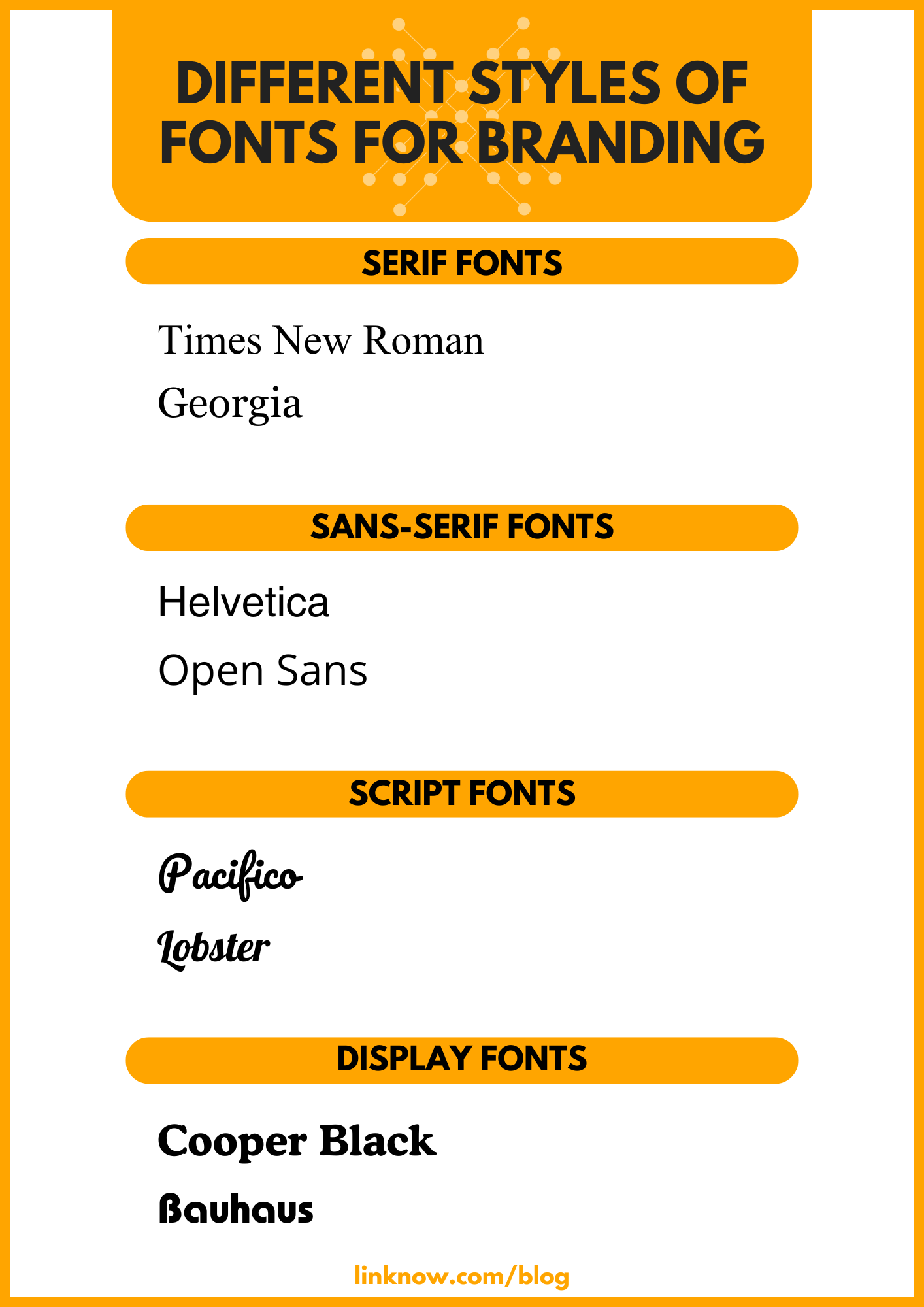
Common Font Personalities
Each font family has its own “personality,” and understanding these categories helps you align your design with your brand identity. When used thoughtfully, font pairings can create contrast and hierarchy that help your readers know what’s important at a glance while keeping your visual identity cohesive.
Here’s a look at some of the different options:
- • Serif fonts: Convey tradition, trust, and authority. They’re great for professional services such as law firms, financial advisors, or educational institutions.
- • Sans-serif fonts: Feel modern, clean, and approachable. These are ideal for tech startups, healthcare providers, and small businesses that want to appear fresh and forward-thinking.
- • Script fonts: Express elegance, creativity, and personality. Perfect for invitations, boutique branding, or artisan products, but are best when used sparingly to maintain readability.
- • Display fonts: Bold, unique, and attention-grabbing. These work well for logos, headers, or advertisements, but should never be used for long paragraphs or web copy.
Readability and Accessibility
Even the most beautiful font loses its impact if people can’t read it. Hard-to-read text frustrates visitors, increases bounce rates, and makes your business appear less credible. Search engines also favor user-friendly websites, so good typography supports SEO performance as well as accessibility.
Follow WCAG (Web Content Accessibility Guidelines) to ensure your text is easy for everyone to read. This includes maintaining sufficient color contrast between text and background, using large enough font sizes (typically at least 16px for body text), and avoiding overly decorative typefaces for essential information.
Ultimately, typography is about balance. Your font choices should express your brand’s personality while ensuring every visitor can comfortably read and engage with your content. When chosen carefully, fonts become one of your most powerful storytelling tools.
The SEO Connection: Why Design Choices Matter for Rankings
While search engines don’t directly rank your site based on color palettes or font choices, your design decisions influence the behaviors that do affect rankings. Good design creates trust, encourages engagement, and keeps people exploring your pages longer—all signals that search engines use to gauge site quality.
Lower Bounce Rates Through Trustworthy Design
As we already covered, visitors make instant judgments about credibility. If your website looks inconsistent, cluttered, or outdated, users are more likely to leave within seconds. That behavior increases your bounce rate—a metric that tells search engines your page may not meet visitor expectations.
A cohesive, professional design does the opposite. It gives users confidence in your business, making them more likely to stay, click through other pages, and take action. That engagement helps search engines recognize that your site delivers value and deserves higher placement.
More Backlinks From Share-Worthy Design
High-quality backlinks remain one of the strongest SEO ranking factors. Well-designed, visually appealing websites naturally attract more attention and shares from bloggers, influencers, and other businesses. When your layout, colors, and typography make your content look professional and polished, it becomes more link-worthy.

Enhanced User Engagement and Dwell Time
Design affects how long people stay on your site, which is known as dwell time. Clear fonts, harmonious colors, and intuitive navigation make it easy for visitors to read, scroll, and interact with your content. That longer engagement tells search engines your content is relevant and worth ranking.
Even small design tweaks (like increasing font contrast, improving spacing, or using a consistent visual theme) can lead to measurable improvements in user behavior metrics that influence SEO performance.
Design and Content Create a Powerful Partnership
While design shapes perception, content drives performance. Beautiful design draws visitors in, while valuable content keeps them there. Search engines reward sites that balance both. In short, good design amplifies the power of your content, rather than replacing the need for it.
When your visuals and message work together seamlessly, you create a user experience that’s memorable, trustworthy, and SEO-friendly. Every color, font, and layout choice becomes part of a bigger strategy that tells search engines (and your audience) that your business means business.
Partner With LinkNow and Make Sure Every Pixel Tells Your Story
Here at LinkNow, we know that your website and social media presence are often your first and most powerful introductions. That’s why we put a great deal of focus into helping our clients choose the best design elements to represent their businesses. When those design choices align across every platform, they build recognition, loyalty, and credibility.
If your website or brand visuals aren’t sending the right message, it’s time for a change. Get in touch with LinkNow to make sure every aspect of your online presence tells the story your small business deserves to share.